CASE STUDY: Product & digital checkout flows
The Allconnect brand is a marketplace for internet, TV and phone services with multi-company servicability technology that allows a user to shop several service providers simultaneously. Recently, the call center driven monetization model has switched to digital product flows which have a lower conversion rate, but are less costly for the business.
| SKILLS |
User flows, User journeys, UX writing, Microcopy
|SCOPE OF WORK|
The digital checkout flow (or carts) for Allconnect.com consists of five partner carts with three co-branded experiences. The work highlighted for this case study will primarily revolve around the co-branded experiences.
User flows, User journeys, UX writing, Microcopy
|SCOPE OF WORK|
The digital checkout flow (or carts) for Allconnect.com consists of five partner carts with three co-branded experiences. The work highlighted for this case study will primarily revolve around the co-branded experiences.
My role on Allconnect.com's cart team was as the content strategist.
| STRATEGY |
Before each cart initiative, a project kickoff was held with cart business associates, developers, and creatives where we learned of drop-off rates for users. Based on these rates, separate project initiatives were launched to hold user engagement and increase conversion.
| STRATEGY |
Before each cart initiative, a project kickoff was held with cart business associates, developers, and creatives where we learned of drop-off rates for users. Based on these rates, separate project initiatives were launched to hold user engagement and increase conversion.
tooltips & modals
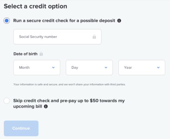
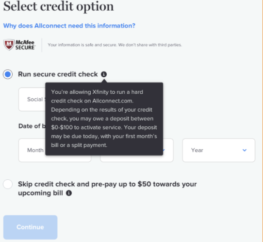
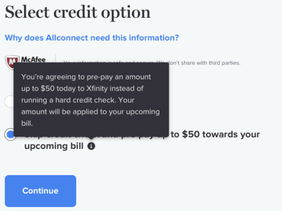
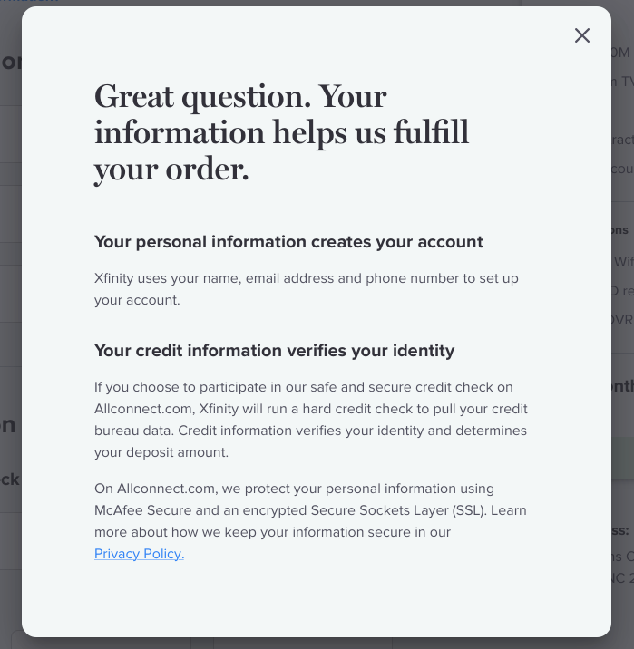
This project initiative was launched after a noticeable drop at the credit check step of the digital checkout flow. After user testing, it was found that users didn't trust the security of the site, and were confused about the options available to them. To solve for these user concerns, content was added to explain the usefulness of credit checks, the credit check options available and security messaging surrounding a newly added McAfee logo.
notifications
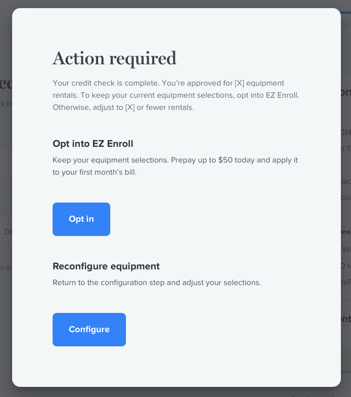
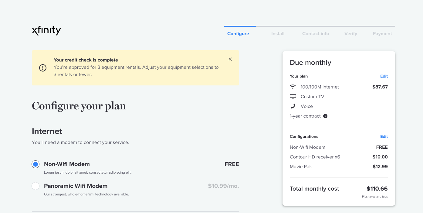
With a variety of user paths throughout the digital checkout flow, users would inevitably encounter scenarios that would either require notification of approval, error or caution. In the instance highlighted, the user has completed a hard credit check and has qualified for only a limited number of devices. The strategy was to inform the user of their partial approval while not emphasizing that the user didn't have sufficient credit to rent all of the devices initially added to their cart. Additionally, users had another non-credit option available if they were not satisfied with their credit results.
loading states
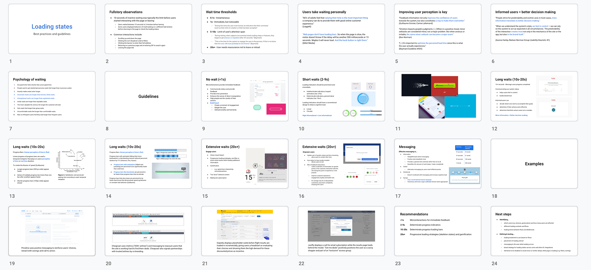
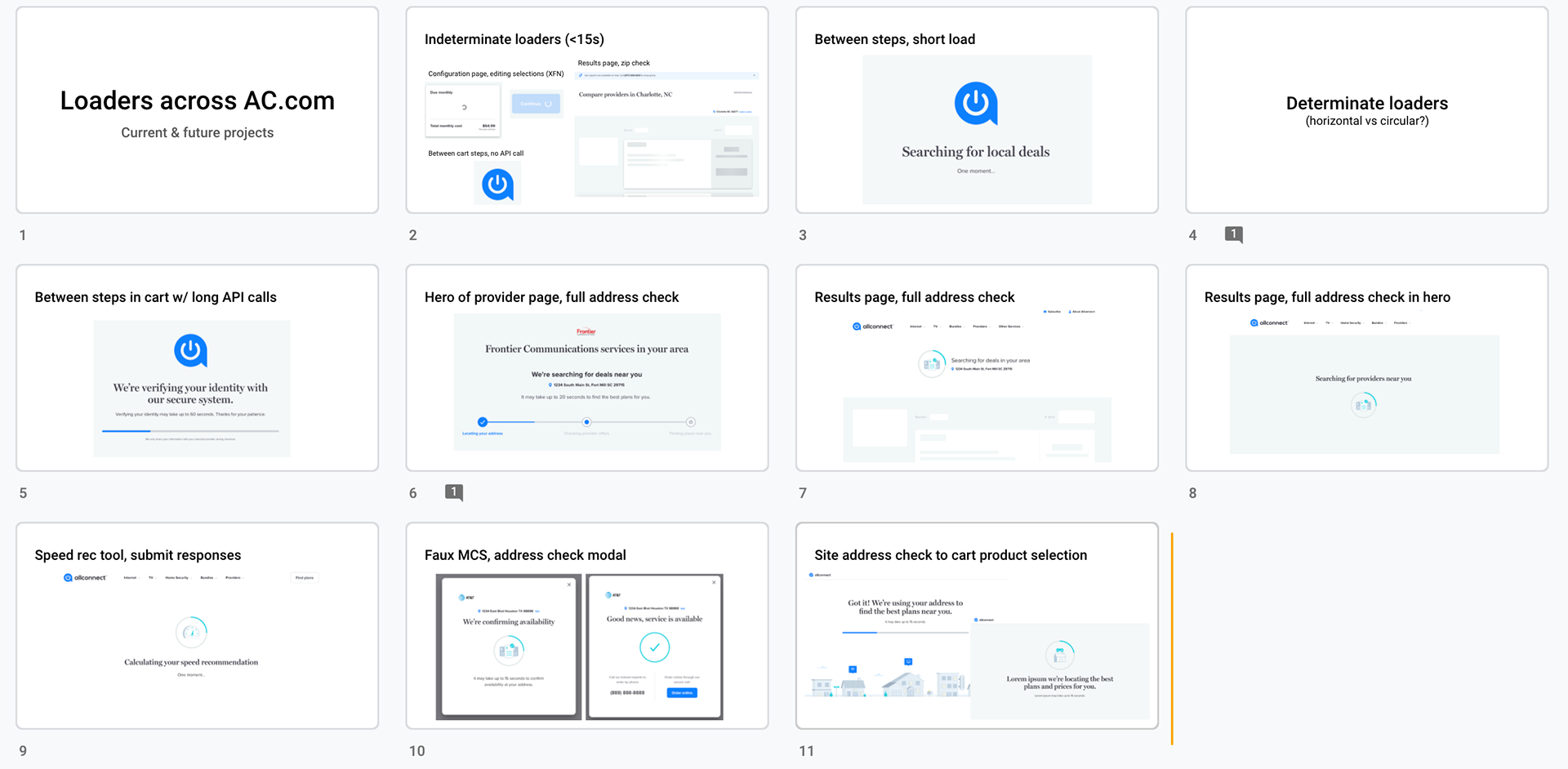
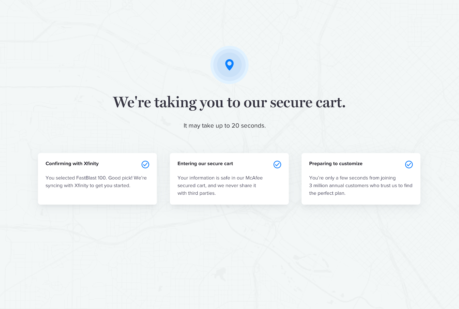
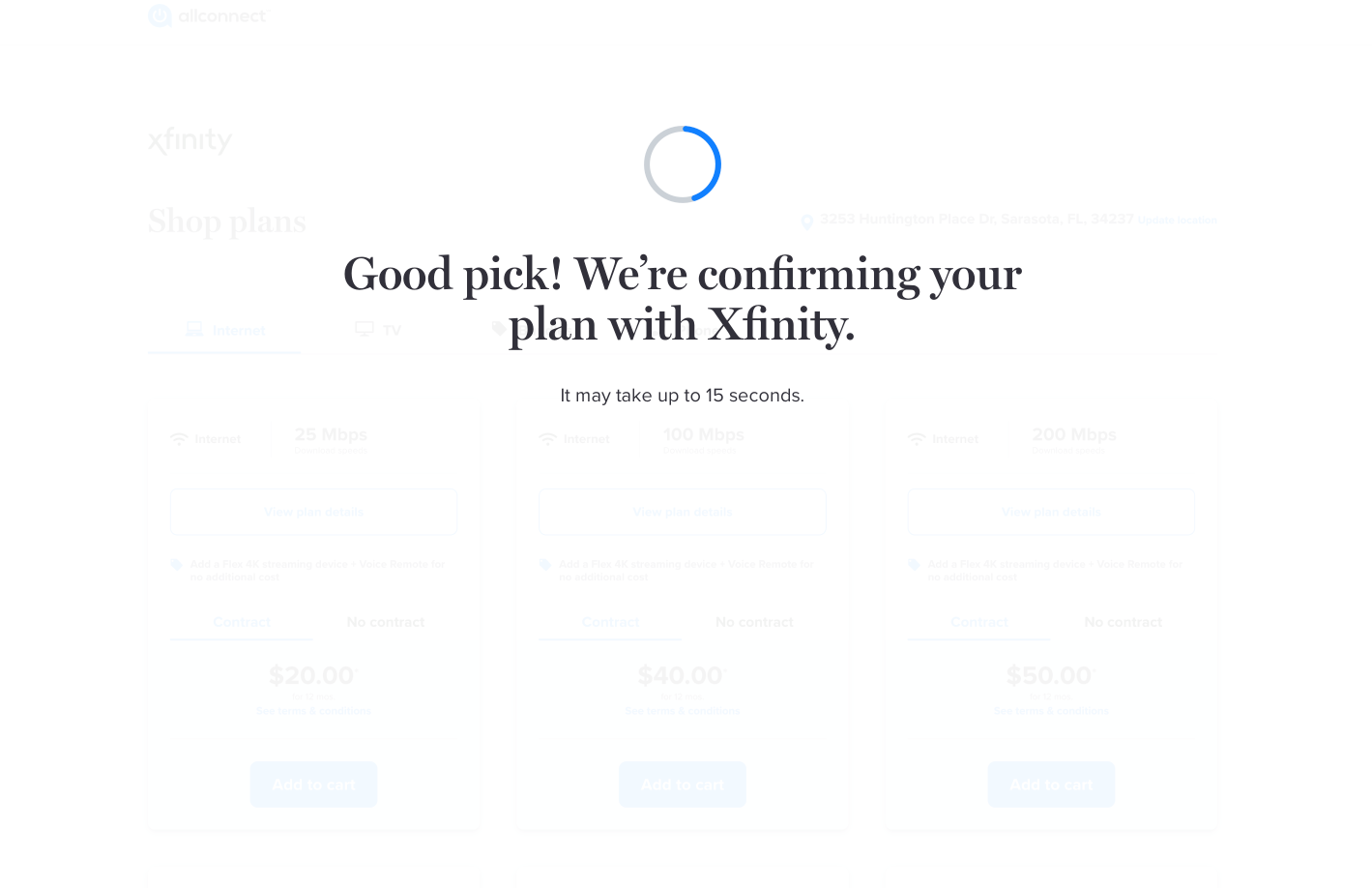
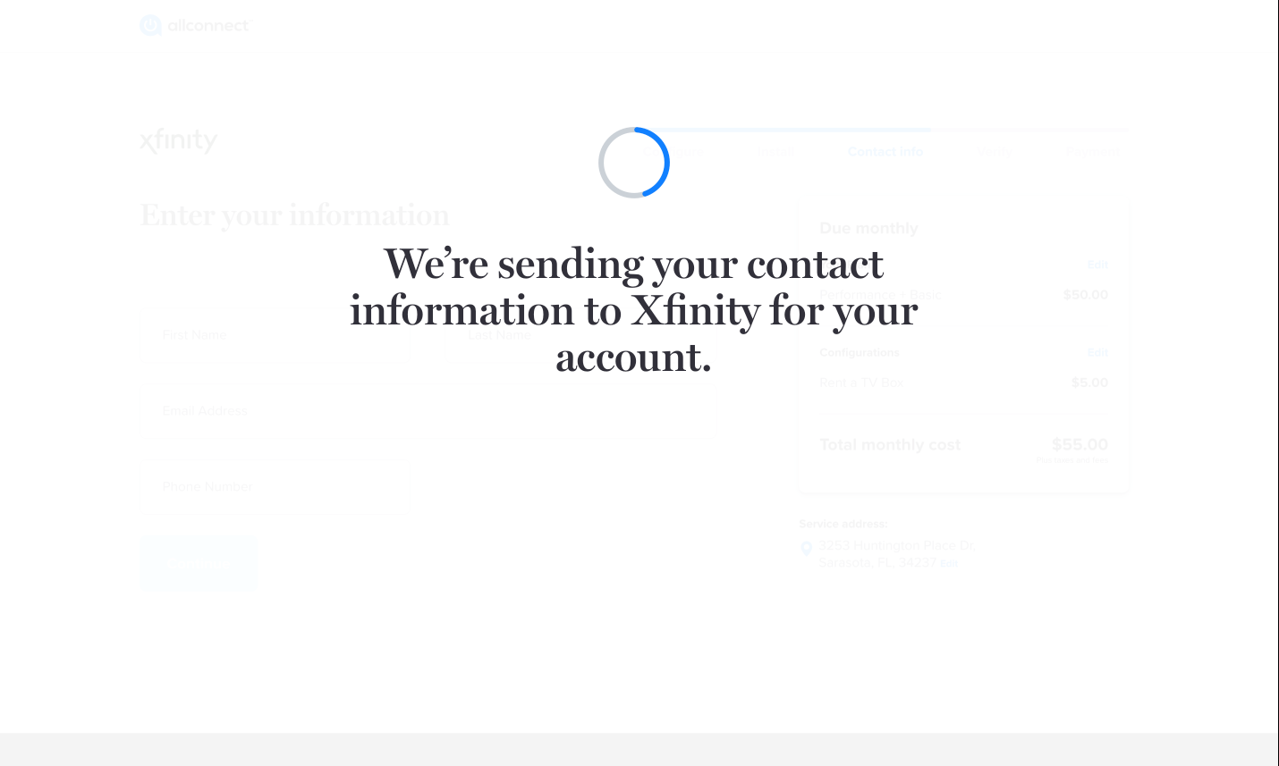
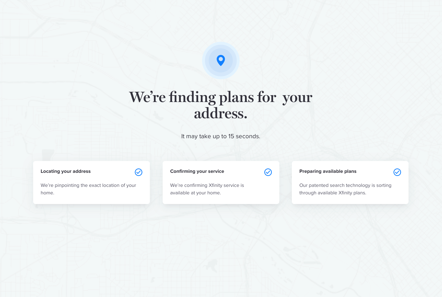
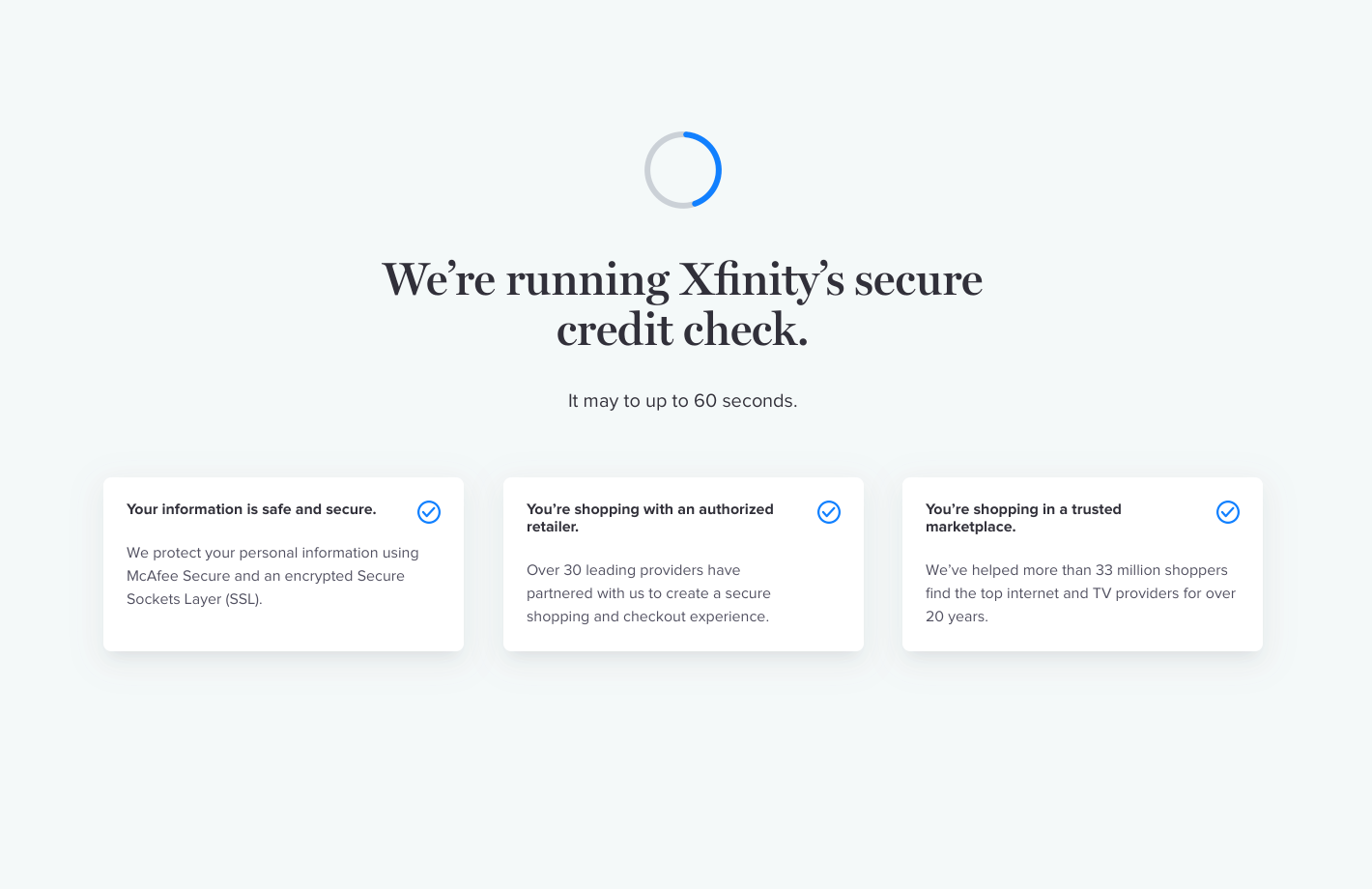
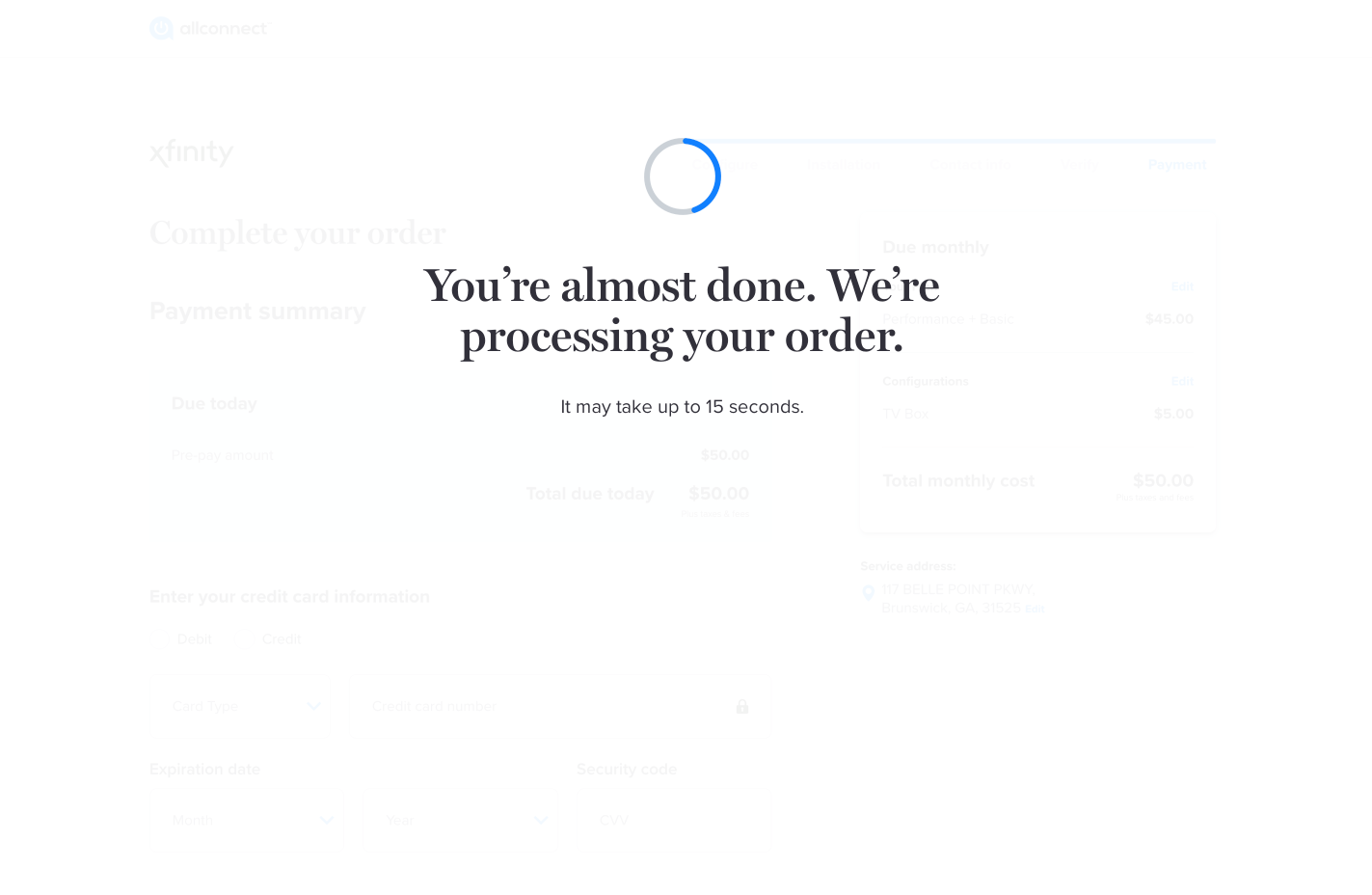
To help users transitioning throughout the digital checkout flow, progress indicators with accompanying copy were added to loading states as an opportunity to increase visibility of system status. For consistency, similar imagery and placement was used in the loading states on site into the digital checkout flow and throughout the cart. To make sure loading states would be consistent, an audit was conducted across the site. Researching on loading states and findings from the site audit informed the strategy for the final content.
research and audit
loading screens
After initial user testing, it was found that users delighted in the friendly tone of the loading state. Several users visibly smiled at the "Good pick" copy in the second loading screen.

product carts upselling
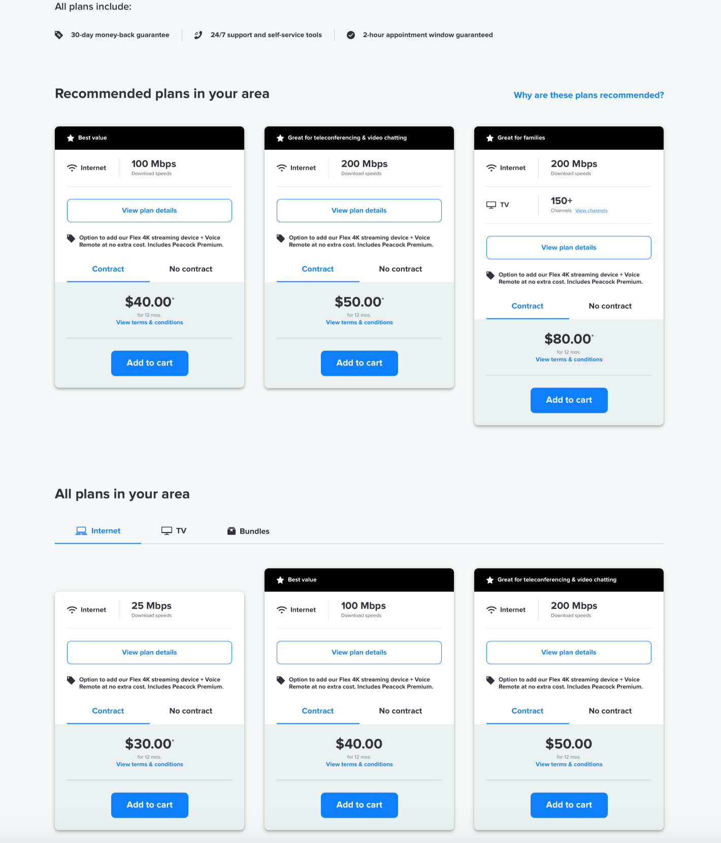
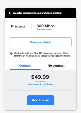
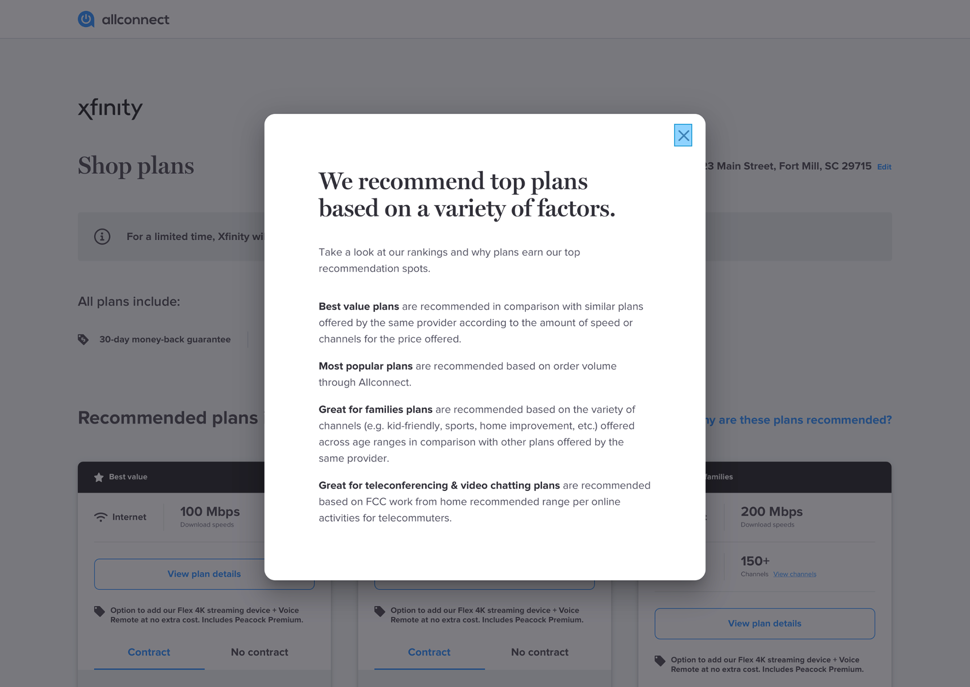
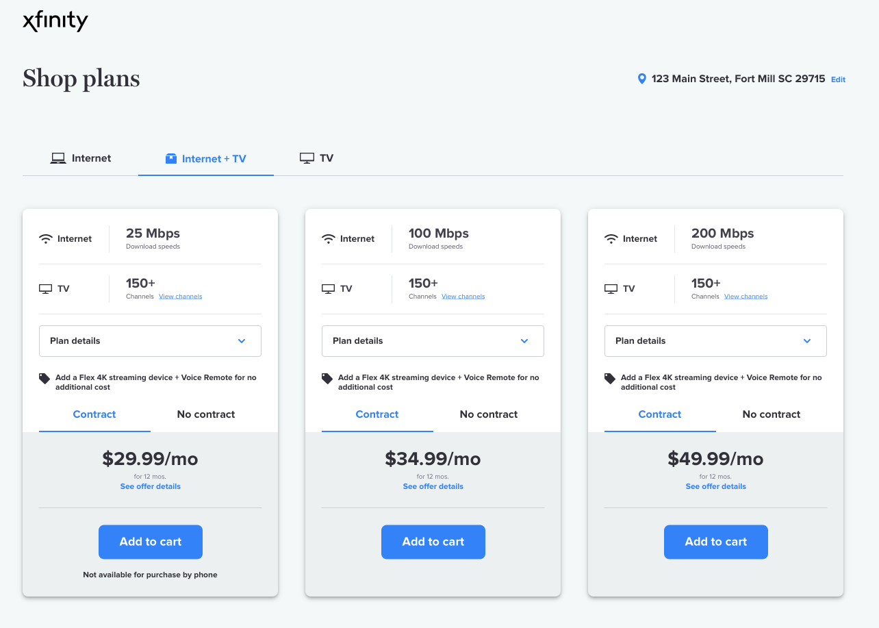
After receiving notice that cart conversion was high but rates per active (RPA) were low due to users purchasing too much of the lower priced products, a project initiative was launched to subtly upsell users into products with higher RPAs. The content strategy was to add user-centric superlatives to higher-price products. The majority of time strategizing was spent trying to find a methodology that would accurately describe the products and authentically back the superlative with research presentable to users. The superlatives were added to the product cards along with a linked modal explaining the methodology.
product cards superlative methodology
product selection - product cards with superlatives
| WHY SHOULD YOU CARE |
In each of these projects, I learned how a small addition or deletion of copy could drastically increase conversion for users. I also learned how essential it is to seemingly over explain and oversimplify parts of the checkout flow where users may feel insecure. The conversational language used during the loading states put users at ease. The added credit check copy increased user engagement and decreased drop off rates at the credit check step. Additionally, the added notification for credit approval status clarified users' device selection options. The added superlatives resulted in decline in the lowest RPA products by apprx. 13% and an increase in one of the higher RPA products by apprx. 11% resulting in an overall increase by apprx. 11% without sacrificing conversion rates.