CASE STUDY: Rebranding
The Allconnect brand is a marketplace for internet, TV, and phone services with multi-company serviceability technology that allows a user to shop several service providers simultaneously. Throughout my time working on Allconnect.com, I co-led the branding initiatives with the Director of Design.
| SKILLS |
Collaborative user research, Persona sketches, Competitive analysis, Needfinding, Wireframing
|SCOPE OF WORK|
When I joined the Allconnect team, the business had recently undergone a rebranding of the look and feel of the site, but had not done a deep dive on underlying brand ideas. My time building the Allconnect brand included creating a brand pyramid, collaborating on user personas, revising voice, refining tone and creating branded modules on site. The highlighted projects will span that work.
My role on the Allconnect team was as the content strategist and brand pod co-lead.
| STRATEGY |
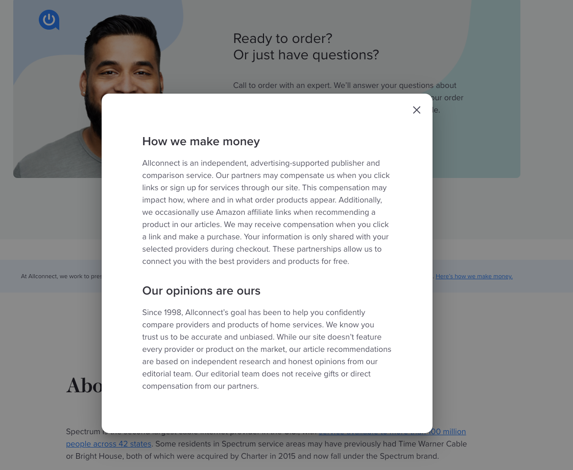
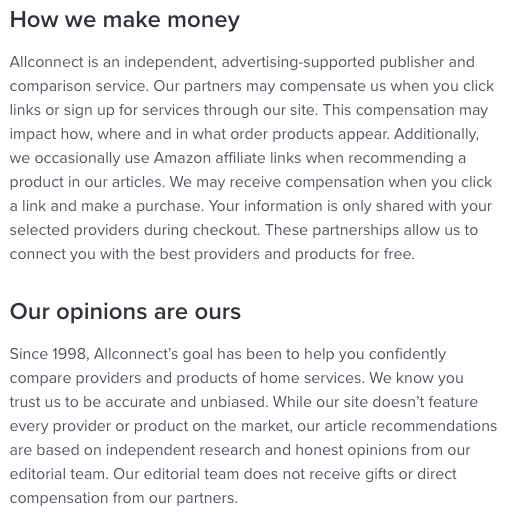
One early branding project included rewriting the editorial policy modal for the resource center in effort to establish trust with users. Beforehand, the unbiased stance of Allconnect wasn't explicitly stated on the article pages on site. The strategy was to inform the users of partnerships with service providers, but also the separation of compensation from editorial writers' opinions. The banner below was placed in the heros of appropriate pages on site.
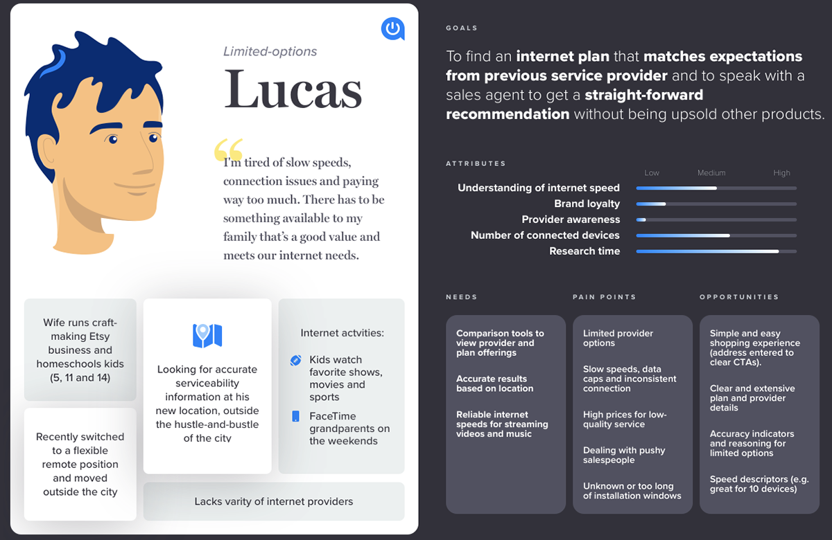
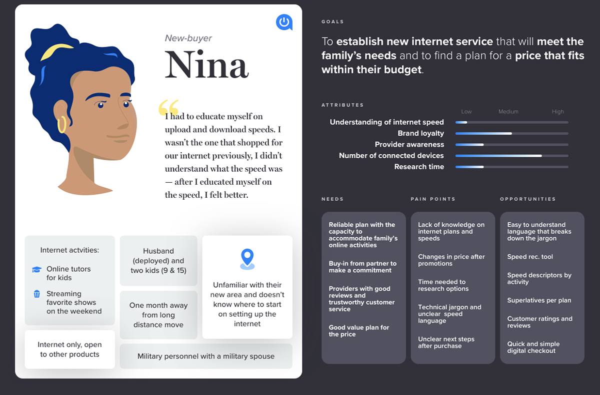
user personas
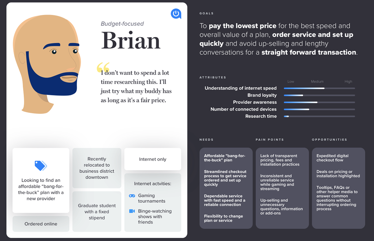
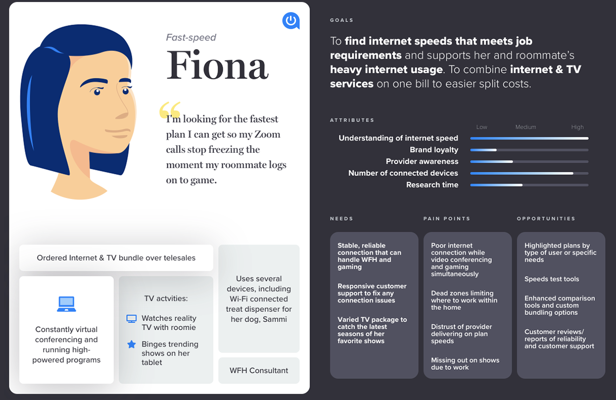
The Allconnect user personas were created from the collaborative work of a tiger team consisting of two UX designers, the Director of Design and, myself, the Content Strategist. This small creative team worked with the Allconnect business associates and data analysts to collect data through user interviews, sales center representatives and site analytics. Once research was collected, the creative team held two half-day mini sprints to draft four personas capturing the primary demographics of the site. Outliers were not included in the first set of personas.
My role consisted of observing user interviews, interviewing sales center representatives, contributing during the sprints, and refining the content for the personas cards highlighted for this project. I also provided feedback and consultation on the final design. These personas are currently used by Allconnect to draft user journeys and are to be shared with the Allconnect business.
home page redesign
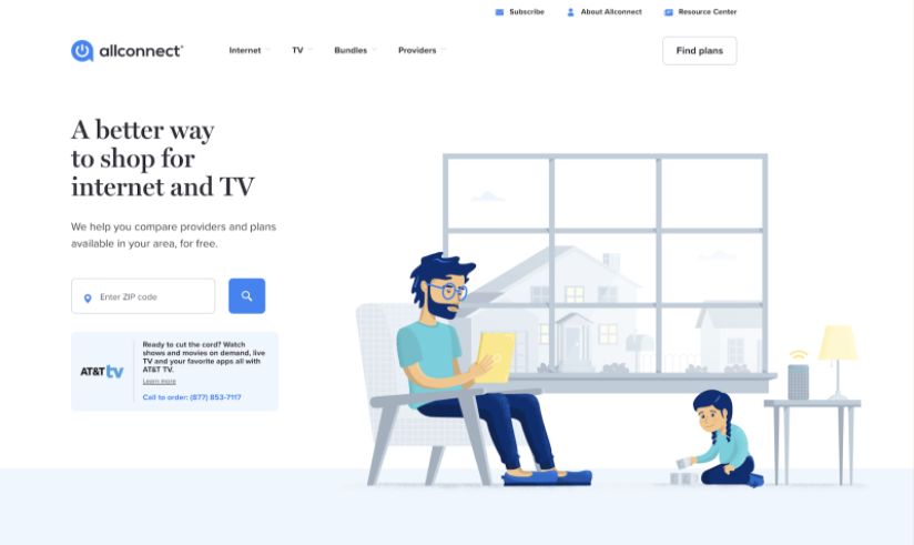
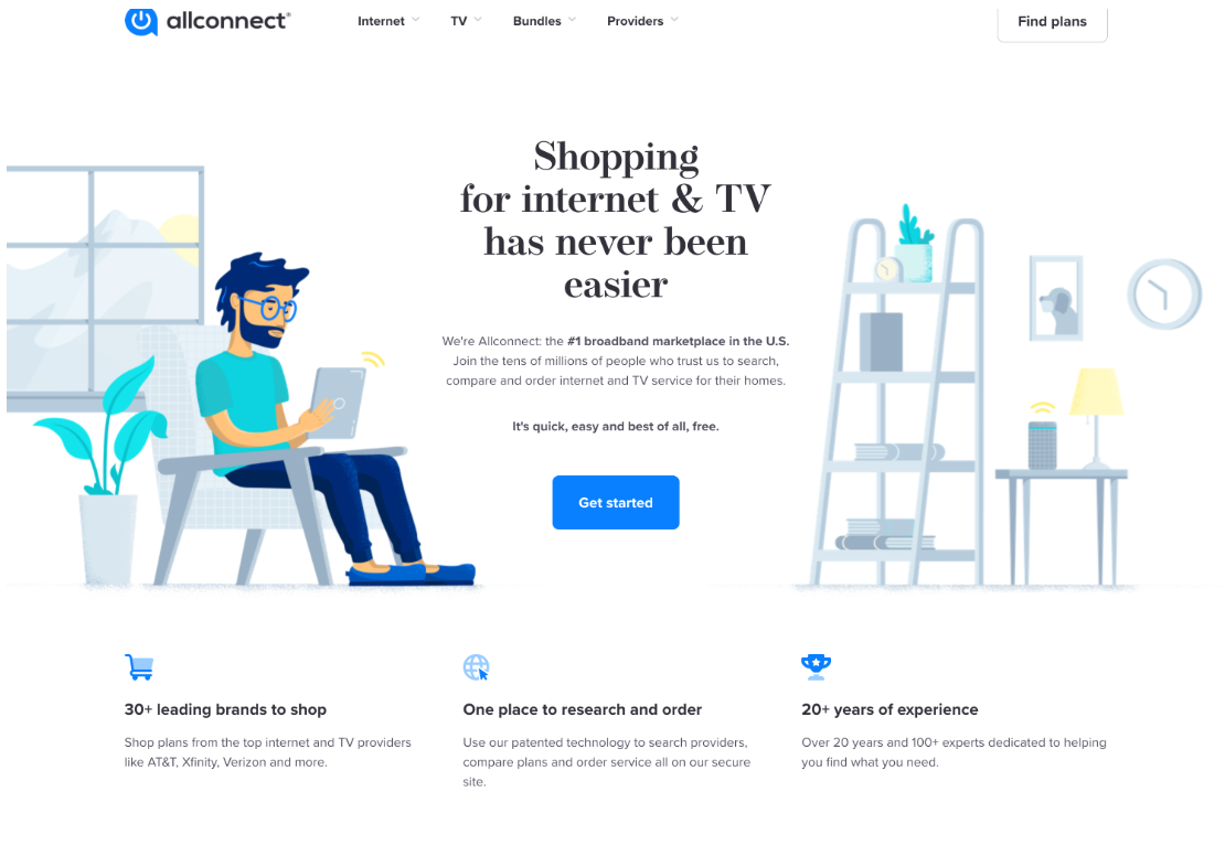
After writing new value props for Allconnect across several branding areas on site, the Allconnect.com home page was due for an upgrade to be more cohesiveness with the updated messaging across site. The strategy was to briefly explain the value of Allconnect to the user and to make it clear that Allconnect is a marketplace, and not a provider, a common misconception discovered through user testing. The home page also needed a more personal human element in combination with the playful illustrations of the site. My role on this project was to drive the content strategy for the new page and to collaborate with the Director of Design on the complimentary design and imagery.
The strategy for the new home page hero was to bring more of the value props into the hero, with a user-focused rewriting of those values. It was also important to highlight the claim of being the number one broadband marketplace, which had recently been confirmed in a collaboration with AC legal. The new "Get started" CTA would trigger a full address collection modal, a business-wide strategy for Allconnect.com, as full address allowed serviceability technology to return more accurate results to the user.
On the left is the initial Allconnect home page hero; the full page on the right is the updated home page. The two heros were tested against one another with the test winning. The test generated 26% more location data collection, 15% increase queue response rate, 12% increase in visit conversion and 4% increase in visits.
The overall strategy for redesigning the hero is mirrored on the remainder of the home page. Each value section was crafted to be user-centric, with a focus on trust and convenience. The language “marketplace” helps the user frame Allconnect as a resource for comparison. User test findings indicated that users were still not sure that Allconnect is not, itself, a service provider, but a resource for comparing providers. To further explain how Allconnect as a marketplace, there’s a focus on convenience language of saving time on comparison, saving money with comparison, and having multiple ways to shop, all with expert guidance. The benefit of using Allconnect over researching alone is made more visual with a comparison chart and a friendly-face expert positioned above the article curation section.
branded components
One component of the Allconnect home page redesign included a new use of a stock photo with accompanying copy positioning the man as an Allconnect expert. We named him "Albert Connect." The content for this component emphasized the expertise of Allconnect sales representatives, the security of the digital checkout flow, and official partnerships. With strong conviction that this human element could lend to success, the Albert Connect component was tested separately with the results application and partner pages on the site.
The results were a 5% increase in queue response rate, 29% increase in queue conversion, 25% increase in visit conversion and 37% increase in visits at only the 50% mark of testing. After the test ended, Albert Connect was a unanimous win and was rolled out across site, where appropriate.
brand pyramid
One of my major branding initiatives on Allconnect was creating the brand pyramid, a pillar of Allconnect's mission, values, functional benefits, emotional benefits, table stakes, and promise. The project stemmed from a smaller initiative to redesign and consolidate the About us page with other informative pages on site.
After the initial About us brief and brainstorm, it became clear that in order to address some of the outstanding sections for the About us page, a deeper dive into brand would need to be had. The result was a several weeks long deep dive into the Allconnect brand.
After drafting initial content, a series of brainstorm sessions were held to refine brand ideas with stakeholders: the Vice President, Senior Business Associates, Editorial leaders and SEO leaders.
The resulting ideas would define the future of the Allconnect brand. As this was my final project with Allconnect.com, the final visual pyramid is still in design at the time of this writing.
This project is ongoing.
| WHY SHOULD YOU CARE |
In this series of projects, I acted as the brand lead on the creative team. As most of the branding revolved around content, I led the initiatives for overall branding on the site and acted as an accountable partner to the Director of Design. With this responsibility, I had a large stake in shaping the voice and perception of the brand across the site, the digital checkout flows and the offsite branding.